Today as I was configuring some build settings in Qt Creator, an otherwise really great product, I was faced with this extremely frustrating situation:
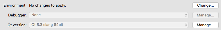
I absolutely, definitely needed to configure the debugger. However, the controls required to do so were disabled, as can be seen by their greyed out visual state. Although it was easy to find the controls for configuring the debugger (good discoverability), it was impossible to find out exactly why the software would not allow me to do so.
What made this even more frustrating, is that it would have been straight-forward for the software to have shown me an informative tooltip or dialog box when I hovered over or clicked on the disabled controls. This message could have explained shortly why the control was disabled, and what exactly I needed to do to resolve the problem.
If you have or you were planning to use disabled controls in your next project without an easily discoverable (read: right on the disabled control itself) explanation of the reason (and fix) for having disabled them, I would like to say this:

I’ve singled out Qt Creator due to my experience today, but there are too many examples of this in modern user interfaces. Hooking up discoverable explanations to disabled controls is a small effort on the part of the programmer which multiplies to a significant time-saving and thus value-add for your users.